HomeAboutContactWebsite

Tuesday, January 31, 2012

IDS12 impressions from a designer


This past weekend I attended the Interior Design Show in Toronto with 5 of my girlfriends who just happened to be design professionals too.

Catch my Impressions of the IDS12 here at Ottawa at Home Magazine!

001 Collage (1)

Click on picture to see the Post in Ottawa at Home Magazine


Here are a few pictures I took of the show, enjoy the eye candy!

001 collage (1)

  • Small scale Living- Dee Dee Taylor Eustace

001 collage (1)

  • Fun design- Nordsouth & Living Lighting on King


001 Collage (1)

  • BY_LISSONI & Gresham house


001 Collage (1)

  • ELTE


001 Collage (1)

  • Showstopper - Bloomsbury Kitchen  

001 Collage (1)


001 Collage (1)

001 Collage (1)


For more great blog post on IDS12 visit the links below

Lisa Goulet Design  and  JAX does design  & Maureen at modecor muses


signtature-001

Monday, January 23, 2012

IDS12 Trends & Highlights


As of Thursday afternoon I am off with a few of my designer gal pals to the Interior Design show in Toronto. This is my 5th year at the show I believe and it never fails to amaze me, always incredible things to see and learn. This year I have gotten the inside scoop on on a few of the trends and Highlights of the show. Here is your sneak peek into IDS12

Slow Design

Encompasses traditional design using local & natural materials, handmade craftsmanship and influence, its back to basics at its best

Urban Tree Salvage

image

Holtz

image


Holtz Furniture – Modern, organic furniture art

Holtz Furniture is a family owned and operated furniture company that prides itself in designing and producing modern organic furniture art.  They incorporate various elements to form living furniture art pieces, yet designing them so they remain functional for everyday use and display.  Their wood is sourced from various countries and regions throughout the world with emphasis on trees that have perished due to urbanization and natural causes. 


image

SNOB

Twig Side Table

SNOB Furniture - uses the talents of the South African people to produce exquisite products of modern design and art form.


Studio North

This year at IDS 12, STUDIO NORTH celebrates its 10TH anniversary of showcasing the best in Canadian Design. Studio North is a jury-selected display of established and emerging Canadian Designers, Often described as a show-within-a-show, that is beautifully set-up like a gallery.

Atelier 688- handcrafted Rope lights. A one stop Art and Design studio located in Toronto’s Art district of Queen West, Atelier 688 showcases the work of local Canadian artists and designers with a leaning towards the use of reclaimed and vintage materials.
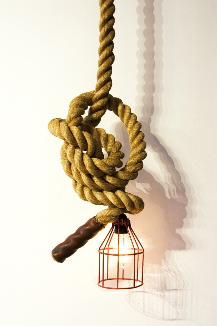
Unique climbing rope light

Atelier 688


 Kino Guérin is a contemporary artist from Montreal. Guerin challenges himself to make furniture with a unique piece of wood, no legs, crossbars or supports. Bending the extremities until they reach the floor, the table below reflects the equilibrium between the curve and the straight line, between exuberance and purity.

Kino Guérin


Outdoor Living

Homeowners today are using the outdoors as an extension of their living space by bringing the comforts and luxuries of the indoors OUT to enjoy a visually and virtually larger living area.

· Andrew Richard Designs- One of my favourite at IDS has always been the Canadian luxury outdoor furniture line of Andrew Richard Designs. They are known for materials and custom designs, created to enhance the lifestyle of their clients.

Andrew Richard Designs


Paloform – The pieces at Paloform are beautifully modern, hand cast concrete fireplaces and fire pits that are created right here in Canada. They are High-end, very unique pieces that are Eco-friendly.


modern-outdoor-fire-pits

Paloform


Small Scale Living

Small Scale Living, Inspired by condo living involves small-scale furniture, open floor plans, and the elimination of formal rooms it will take IDS 12 by storm this year. It is the year of less is more.


· Domison - Modern living calls for modern solutions. From small spaces to open lofts, DOMISON helps you create the perfect fit for whatever your needs with its new line of modular couches and contemporary living solutions.

clip_image002[8]

Domison


· Bulthaup – The b3 multi-function wall conceals water, electricity and gas pipes and allows cabinets to appear as if they are floating. It becomes active, as functional as it is beautiful, and can merge the kitchen and its surrounding spaces together to form a single unit, simply incredible!

Bulthaup


· Nomo Creations - Jamie Sajdak, a Studio North participant and designer behind Nomo Creations, developed Orbit as an attempt to redefine flat pack furniture, allowing for reduced size and transportation costs, both economic and ecological, and the increased ability for the materials used to be disassembled for recycling/reuse. The whole structure can be flat packed by removing two bolts. I love this piece!

 Nomo Creations


I can`t wait to walk through those doors! is going to be a great show

signtature-001

Wednesday, January 18, 2012

Extreme Makeover Kindness Edition 2012

kindness
I have been asked to be the lead Designer for Extreme Makeover Kindness Edition for the United Way Ottawa again this year and the plans are now under way.

The Lucky Recipient this year will be The Foster Family Farm House Homework club located at 1085 Ramsey Cres, Unit 334 Ottawa.

The Foster Farm House is a Community house * acts as a resource centre where a variety of services and activities are offered. One of those resources is a homework club for kids.

A typical day at the Homework Club goes like this:
The children come in at 5:30 and usually start their homework and request assistance if needed.  Some of the children go into the computer room to do research for reports or projects.  They usually have a snack about 30 minutes into the program which is provided through Kick start program from the Ottawa food bank.  As we know that a hungry child is distracted and not focused so a healthy snack is important. 
The children then return to homework and support from our homework club staff.  Our staff speak English, French, Arabic and Somali.  The children will sometimes ask for additional work to practice math etc. if they are finished their own assignments.  Parents come and pick up the children and talk to the workers at 7:30 the program is finished.  The program runs 3 days a week for 2 hours each night with 30 children using this homework club at any given time.
 
This year once again I invited my dear friends who are also terrific designers to help me make this happen.
 

EMKE Design Team:

185664_10150404489165584_684280583_17418157_3292108_n
From left to right
And joining the EMKE team this year is Sarah Kidder of Sarah Kidder Design (not shown in Photo)
We are pleased to say that D.E. Kinkade Konstruction LTD who was our our supplier of both Labour and martial has signed up to join us again.
All the photography for EMKE 2012 has generously been donated once again this year by Danielle Lynn Photography
To see posts on last years makeover click on the links below
The process
http://sonyakinkadedesign.blogspot.com/2011/02/extreme-makeover-kindness-edition_28.html
The reveal
http://sonyakinkadedesign.blogspot.com/2011/03/extreme-makeover-kindness-edition_02.html
The people who made it possible
http://sonyakinkadedesign.blogspot.com/2011/02/extreme-makeover-kindness-edition.html

If you would like to be a sponsor for Extreme Makeover Kindness Edition 2012 pf the Foster Family Farm Homework Club please email or call
Sonya Kinkade at sonyakinkade@bellnet.ca or 613-838-5252

Watch Sonya on CTV Morning Live talk about Extreme Makeover Kindness Edition


WE NEED YOU HELP OTTAWA!!

Here is a list of items we need to complete this makeover. If there is anything on the list you can help us with please contact sonyakinkade@bellnet.ca 613-838-5252

What we need!
  • Wall shelves
  • Memo peg boards
  • Large clock
  • Small wall mounted TV and VCR
  • Office supplies
  • school supplies
  • Window shades
  • Durable flooring
  •  air conditioning
  • Track lighting
  • Lumber and supplies
  • Colourful chairs for kids

Tuesday, January 17, 2012

Small but Mighty!!


This small bathroom was part of a full house renovation of a somewhat small bungalow. There were two bathrooms in the home, one small powder room off the back of the house and this small main bath. The picture shown is after the bathroom was gutted. There was an existing pedestal vanity, bath/shower combination and a toilet...that is it.

sonya 029


Beside the bathroom was a small linen closet I was able to relocate in another area of the home leaving us the option to knock through the wall and closing up the linen closet door. This allowed us to have enough space to add both a stand up shower and a bathtub.

sonya 028


We now had a fairly large walk in shower where there was none. To add interest to the shower without the price tag I added different tiles laid in an interesting format. For interest on the floor, instead of using your typical 2 x 2 tile I used a small mosaic with interesting colour combinations for texture. The main wall tile was a 12 x 24 tile and to add interest I added two banding's of mosaic tile in between.

©JessicaDeeks_JMD0371_2012-01-12_SonyaKinkade_WEB_WM


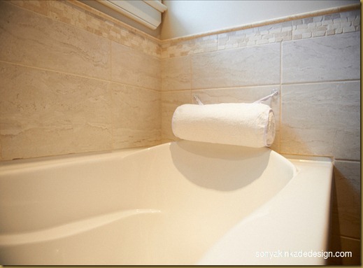
Continuing the tile from the shower, I used it around the tub area taking a fairly average tub to a new level.

©JessicaDeeks_JMD0382_2012-01-12_SonyaKinkade_WEB_WM©JessicaDeeks_JMD0385_2012-01-12_SonyaKinkade_WEB_WM


I accented the small window above with a beautiful soft Roman shade to bring softness where there wasn't. A small burlap stool was used as a spot to sit or hold a cup of tea while enjoying a long soak. The burlap also added a new texture to the room.

©JessicaDeeks_JMD0399_2012-01-12_SonyaKinkade_WEB_WM

©JessicaDeeks_JMD0403_2012-01-12_SonyaKinkade_WEB_WM©JessicaDeeks_JMD0388_2012-01-12_SonyaKinkade_WEB_WM


There was still not a large enough space for a large vanity to hold everything, so I had a shelf installed above the tub where you could keep your bath items, as well as giving that area the finishing touch it needed.

©JessicaDeeks_JMD0378_2012-01-12_SonyaKinkade_WEB_WM


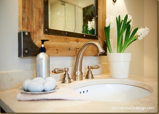
Because we saved money in various areas on this project with sale items and box store stock items we were able to top the wood vanity with Crema Marfil marble that complimented the tile in the shower and tub surround nicely. We were also able to top with a large goose neck faucet with white porcelain Hot and cold symbols on the handles.

©JessicaDeeks_JMD0396_2012-01-12_SonyaKinkade_WEB_WM


For the vanity I wanted something that would warm up the space and create drama even though it was small in scale. What better way to do it then with a solid oak, antiqued finished French Empire vanity that I found on sale. I added a gorgeous mirror in the same finish with metal detailing that topped it off nicely. Art work was added for a splash of colour and this bathroom owns up to its name...Small but Mighty!

©JessicaDeeks_JMD0365_2012-01-12_SonyaKinkade_WEB_WM

signtature-001

 
Blog Design by April Showers
Install by Designs by Dana