As most of you know I was the lead designer on a project called Extreme Makeover Kindness Edition that was taking place at the Good Companions Center in the heart of down town Ottawa during Kindness week in the capital.
My first visit to the Good Companions Center was January 7th 2011 and this is what I was faced with upon walking in the door. I was requested to make over a small store area to be created in the lobby along with the entire reception area and entrance. This was a BIG one and I was going to need some help!
I called on the best of the best here in Ottawa and also my dear friends to lend me a helping hand in this rather large undertaking. My crew, Lisa Goulet (Lisa Goulet Design), Kelly James (JAX Decor and Design), Donna Hargrove (DH Designs), Nicole Duguay (Solace Interiors), Mary Anne van Gaal (Otta Decorate!) and Maureen Coates (MODECOR)
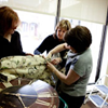
Our first meeting was January 13th at the house of Lisa Goulet were we went over the initial plans for the space….along with enjoying a glass….or two of wine
We decided on using a variety of paint colours for the space. Our thoughts were that in order to get a large impact in such a large area it needed to have a mixture of colours. This would make the eye move around a large area and land on each vignette. We realized fairly quickly the space needed to be warmed up, it was very institutional and fabrics should be added to help soften the space. The basic layout was was done and final thoughts were discussed.
Now came the hard part…getting all the donations, after all this was a gift in kind and every item including construction labour and materials had to be donated. The first on board was D.E.Kinkade Konstruction LTD who supplied all the labour and materials. We then got Tamarack Developments to donated all the paint for the project. With the paint came needing a Painter in jumped Brent Kelly Painting who was going to paint nights to get it all done. We then needed the fabric for the new bench seat and cushions and the new roman blind for the window and Kravet Fabrics was happy to give the fabric along with Rockland textiles who donated the foam for the cushion on the bench.
We called on a few Twitter buddies to help us out, Michelle VandenBosch to look after the floral arrangments , Danielle Lynn Photography to document the makeover and reveal and Matt Leblanc to make a custom art piece for the space.
We then had the furniture….this was tough! Not only did we have to get people to donate the furniture…but it needed to all go together, be senior friendly and the style work with our plan! Guess who came to our rescue…
- The Upper Room – donation of Red leather sofa, 2 occasional chairs, coffee table and end table
- La-Z-Boy Furniture Galleries – Donation of 2 leather chairs and shelving unit.
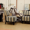
- Premier Executive Suites Ottawa- Donation of two armless chairs, sofa table and end table
- Ottawa International Airport – Donation of 2 armchairs
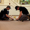
- Floor Coverings International – Donation of Senior friendly area carpet
Now, will everything match? the pictures started coming in on what we were getting from our donating companies. The first to come in was The Upper Room. What they were donating was incredible but the sofa offered was RED leather…Hmmm we already have the colour scheme…can we make it work? regardless we had to! We did not have donations for accessories, so the girls & I all chipped in and went out shopping for bargain pieces to make it all come together
On Friday February 18th we started pulling it all together and having an absolute terrible time as you can see….just miserable!


So amazing! Dying to see the reveal shots!
ReplyDeleteRefurbish, redecorate, rejuvenate, reveal. .. .
ReplyDeleteand relish!!!! remarkable results. . . Bravo!
requesting a peek!!!
Had an absolutely fantastic time working with you and the TBB gang!!! XOXOXOXO
ReplyDeleteWhat an experience!!! Thanks so much for including me Sonya!
ReplyDeleteThe simplicity of its look totally fits the feel of the reception area well, especially from the vibrant colors of the walls, placement of the furniture, to the design of carpet tiles. You know, when I had my home office renovated a few years ago, I went for a minimalistic look while incorporating the design of a sound studio, leading to a professional appeal.
ReplyDeleteHello mate nicce post
ReplyDelete